In Charts: The Afghanistan War
A collection of charts, maps and graphs exploring the longest war is U.S. history.
April 5, 2019
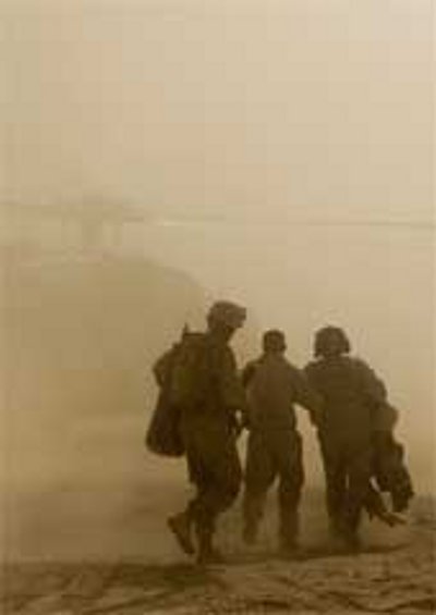
The war in Afghanistan has been going on for 18 years – the longest war in U.S. history.
Below is a collection of charts, maps and graphs exploring the conflict, from its beginning in 2001 following the 9/11 terrorist attacks to where we are now.
Also browse The Globalist’s Afghanistan article collection by clicking here.
Who controls what

Taliban presence by district

US troop strength 2001-2017

Number of NATO Resolute Support Mission troops

The cost of the war

Number of bombs dropped

Number of civilian deaths

Number of journalists killed

Opium production in Afghanistan

Takeaways
A collection of charts, maps and graphs exploring the longest war is U.S. history.